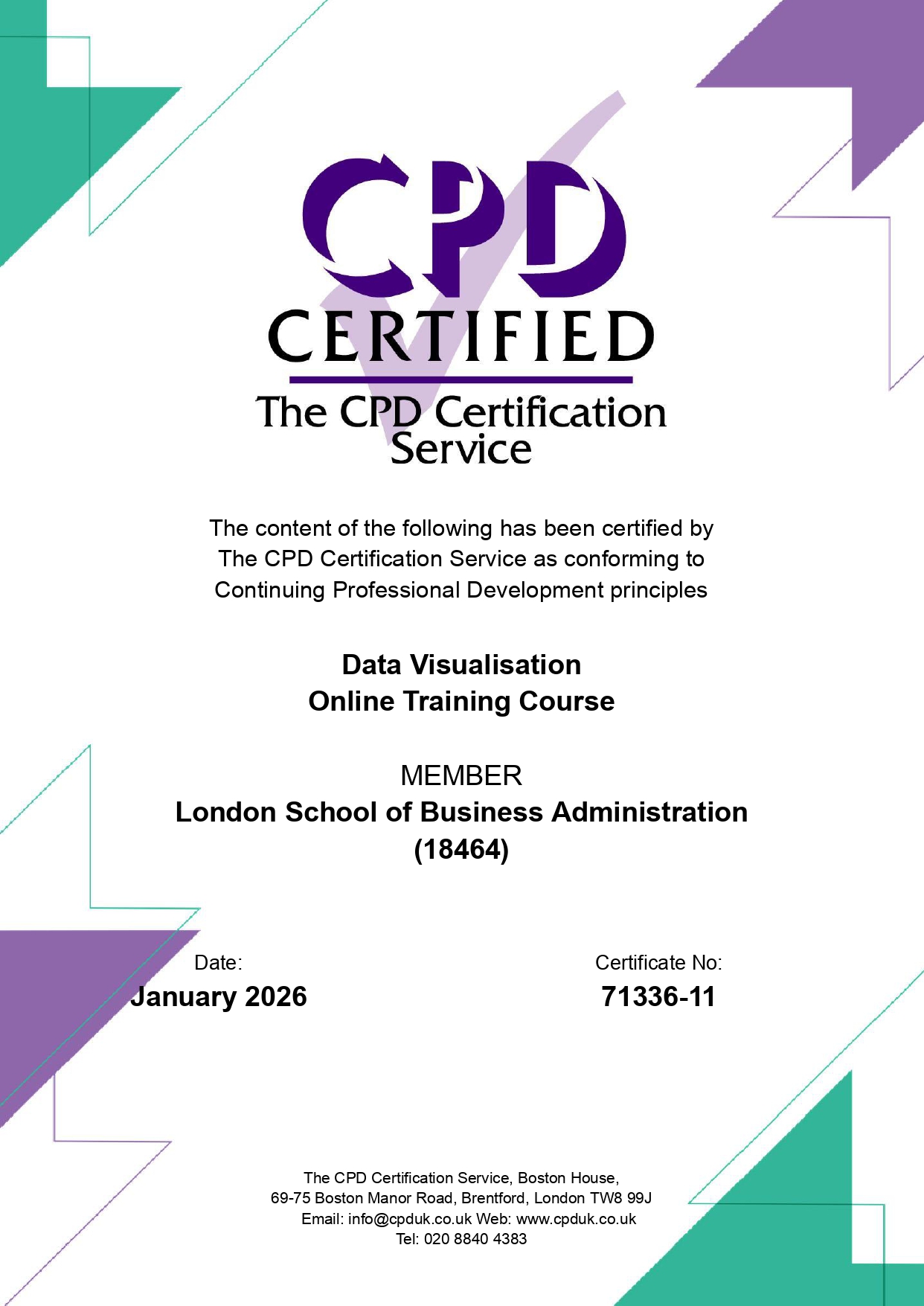
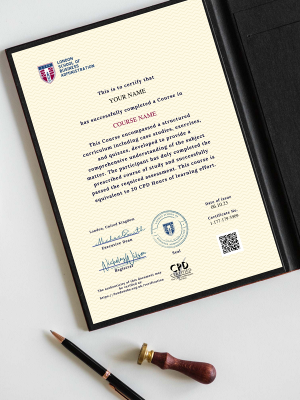
The Data Visualisation Course equips learners with advanced skills in designing, developing, and interpreting visual representations of data to support decision-making and storytelling. In an era where organisations generate and rely upon vast amounts of data, the ability to transform complex datasets into clear, engaging, and actionable visual insights is a critical professional skill. This self-paced course, with a recommended duration of 20 hours, guides learners through both foundational and cutting-edge practices in data visualisation, ensuring they can create impactful visuals that drive business understanding and strategic action.
Course Structure and Content
The programme is structured into ten comprehensive modules, each building on the last to develop advanced data visualisation proficiency:
- Introduction to Advanced Data Visualisation Principles Understand the importance of effective visualisation, including principles of perception, design, and clarity.
- Designing Interactive and Dynamic Visualisations Learn how to build visualisations that allow users to explore data actively through interactivity and dynamic components.
- Data Visualisation Types and Techniques Examine different types of visualisations such as bar charts, scatter plots, heat maps, treemaps, and network diagrams, and understand when to apply them.
- Visualising Time Series Data Develop techniques for representing temporal data, identifying trends, seasonality, and anomalies over time.
- Visualising Multivariate and High-Dimensional Data Explore advanced techniques such as parallel coordinates, dimensionality reduction, and interactive filtering to analyse complex datasets.
- Data Storytelling with Visualisations Discover how to combine visualisations with narrative elements to craft compelling data stories that communicate insights effectively.
- Techniques in Geospatial Data Visualisation Gain skills in mapping and geospatial analytics, including choropleth maps, point maps, and spatial overlays.
- Visualising Statistical Data and Model Outputs Learn to present results from statistical analyses and predictive models in an accessible and meaningful way.
- Best Practices for Creating Accessible Data Visualisations Understand how to make visualisations accessible to diverse audiences, ensuring inclusivity and compliance with accessibility standards.
- The Future of Data Innovation Explore emerging trends such as real-time dashboards, augmented and virtual reality (AR/VR) visualisation, and immersive analytics.
Learning Outcomes
By the end of this course, learners will be able to:
- Demonstrate an understanding of data visualisation principles and techniques, including selecting appropriate visualisation types for different datasets.
- Design and create interactive and dynamic visualisations that promote engagement and facilitate exploration.
- Apply visualisation tools and methods to effectively present time series, multivariate, and high-dimensional data.
- Create compelling data stories by integrating narrative and visual elements for diverse business and academic audiences.
- Explore and implement the latest innovations in data visualisation, including geospatial mapping, real-time visualisation, and immersive technologies like AR/VR.
Learning Materials
Learners will be supported with a range of high-quality resources, including:
- Recorded video lectures to demonstrate key principles and techniques.
- Visual slides providing step-by-step guidance.
- Case studies and examples showcasing real-world applications of data visualisation in business contexts.
- Hands-on exercises enabling learners to design and develop visualisations that reflect authentic challenges.
Assessment
The course concludes with an online quiz consisting of 20–30 multiple-choice questions (MCQs). This assessment is designed to evaluate comprehension, application, and practical understanding of visualisation concepts. Learners are granted unlimited attempts to support mastery and confidence.
Mode of Study
The course is delivered fully online in a flexible, self-paced format, allowing learners to progress through the material at their own pace. This structure makes the course suitable for working professionals, students, and anyone seeking to advance their data visualisation expertise. Â